THE DEVELOPMENT TEAM
GFI DEVELOPMENT COMPANY
GFI Development Company is a New York-based real estate developer that has successfully developed over $1 billion of residential, office, retail and hospitality real estate. Some notable projects include The Ace Hotel New York, The NoMad Hotel and 470 Vanderbilt in Brooklyn. Currently, GFI Development Company is developing approximately $750 million of residential, hospitality and commercial projects. The company’s success is directly tied to its ability to identify unique project opportunities, envision a new future for the property, and execute the development from start to finish.
THE CREATIVE TEAM
MARTIN BRUDNIZKI
Interior Designer – The Beekman Hotel
THOMAS JUUL-HANSEN
Interior Designer – The Beekman Residences
ARCHITECTURE BY
GERNER KRONICK + VALCARCEL
Turreted Silhouette
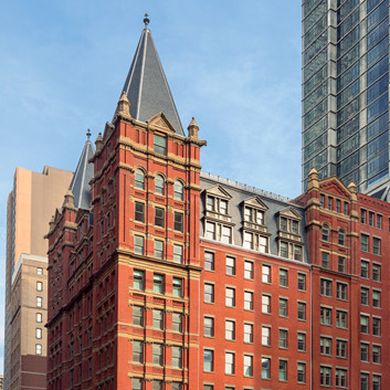
A soaring fifty-one-story new residential landmark that reshapes the downtown skyline. The bold, visionary design by Randolph Gerner of Gerner Kronick + Valcarcel Architects offers a modern homage to its iconic neighbor, the historic Temple Court, the structure housing The Beekman Atrium. The façade is a dynamic reinterpretation of the cast iron elevation of The Beekman Atrium; exposed and engraved concrete columns create a muscular elevation that celebrates the structure of the tower. Above all, the tower’s dual crowns are a tribute to the restored Temple Court turrets.
DESIGN BY
THOMAS JUUL-HANSEN
Bespoke Refinement
One of New York’s most celebrated luxury interior designers. Responsible for the city’s most prized residences, Thomas Juul-Hansen brings his refined aesthetic to the homes at The Beekman, delivering bespoke residences designed to showcase iconic cityscape and river views.
Q & A
WHAT WAS YOUR VISION FOR THE BEEKMAN RESIDENCES?
“It was all about maximizing the project’s greatest assets, the light and the views. We began the process by ensuring corner exposures for every living room. From there, we worked to ensure that the spaces were generous with pleasing circulation and abundant storage. The palette has been kept very warm, with fumed oak flooring and elegant marble in the bathrooms, with fine detailing that echoes the historic Temple Court building. Each residence feels like it has always been a part of the city, while simultaneously conveying the new.”
ALTHOUGH YOUR FIRM IS RENOWNED FOR MODERN CONTEMPORARY LUXURY, YOU ADDED AN EXCITING TWIST TO THE FITTINGS AT THE BEEKMAN RESIDENCES. CAN YOU ELABORATE?
“We approached the finishes as a sort of jewelry paired with an elegant gown. This approach led us to the more traditional styles for bathroom fixtures, and in turn inspired us to rethink the design of typical kitchen cabinet doors which feature a band of antiqued bronze drawers paired with hammered texturing on cabinet doors. It’s a bit more ornate than our typical work and we are thrilled with the results.”
YOUR FIRM IS LAUDED FOR CREATING THE MOST RECOGNIZABLE LUXURY HOMES IN NEW YORK CITY. WHAT SIGNATURE THOMAS JUUL-HANSEN CHARACTERISTICS DID YOU BRING TO THE BEEKMAN RESIDENCES?
“It is similar to our work in such developments as One57 in that we developed the residences to optimize the light and views. The material palette is warm and comfortable, and the detailing is modern but sensitive.”
HOW DID THE ARCHITECTURAL MAJESTY OF THE NEIGHBORING TEMPLE COURT BUILDING INSPIRE YOUR RESIDENTIAL DESIGNS?
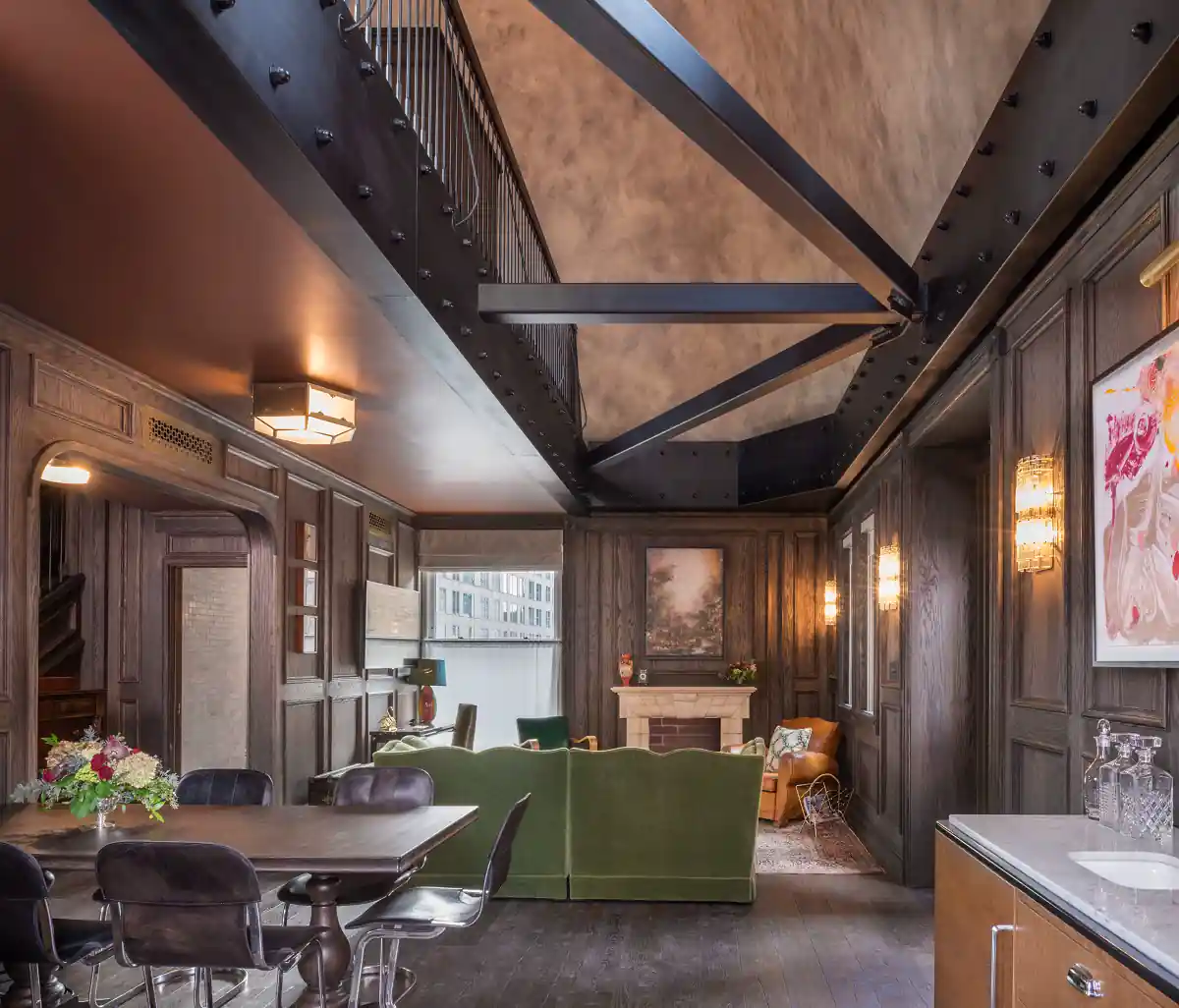
“The allure of such a treasure as the original Beekman building was very strong, and it would be a mistake to deny the connection. With the hotel in mind, we incorporated some complimentary elements such as patterned stonework in the bathroom floors, hammered and antiqued metal finish surfaces, rich wood paneling and delicate metal work in the lobby.”
INTERIORS BY
MARTIN BRUDNIZKI
“When I entered the building, it just spoke to me…. it said, ‘Don’t touch me!'”
Q: GIVEN THAT THE BEEKMAN IS SUCH AN ICONIC BUILDING, WHAT WAS YOUR VISION OR CHALLENGE WITH THIS PARTICULAR PROJECT?
“I remember the first time I entered the grand atrium; it was an incredible, jaw-dropping experience. I felt that the building was talking to me. It was telling me what it wanted to be. It said, “Don’t touch me.” So that has been the approach. I want it to feel like we found this building — we opened the door, and we basically just put furniture into it. That is how we approached this project.”
WHAT IS YOUR TAKE ON THE KIND OF MARK THE BEEKMAN WILL HAVE ON THE NEW DOWNTOWN NEIGHBORHOOD? HOW DO YOU THINK SOMETHING OF THIS FASHION WILL ATTRACT INDIVIDUALS?
“The Beekman will be a destination. First of all, the New Downtown has evolved to a residential neighborhood and the public areas will be quite a draw. It’s going to serve as a beacon for people coming from other places in Manhattan. So I think it will almost be like an epicenter, in the New Downtown, for socializing, for doing business, for staying. I think it will be quite important.”
HOW DID YOU ADD A CONTEMPORARY CONTEXT TO A BUILDING FROM THE 1880S?
“I came into the building, and I saw these amazing details; it lent itself to a sort of rustic environment with a very classical undertone. It provided a great envelope for an eclectic mixture of furniture, giving the feeling that it was a hotel from the beginning. A mix of original heritage pieces combined with acquistions acquisitions from the 1920s, 1950s, and today. That’s what I want the interior to show.”
THE DESIGN DETAILS IN THE PUBLIC SPACES ARE QUITE SPECIAL, ESPECIALLY THE USE OF COLOR AND TEXTURE. CAN YOU PROVIDE SOME INSIGHT INTO THE INSPIRATION?
“A: We wanted to create a progression through space that evolves through texture and color. We are using timber paneling that is going to look like it’s been there forever, so it’s going to be heavily antiqued and distressed, and it will be paired with a beautiful black and white marble mosaic floor. But as you move through those spaces, into the concierge area, the space looks like we found it. The walls weren’t even touched; the cobwebs would still be there. This effect continues in the atrium, which is not going to be a perfectly finished architectural space. It’s going to have flaws in it, intentionally. Within that, we have the furniture, which is sort of an eclectic mix of pieces from the 1920s up until today.”


